The scrap quilt started here has moved on a touch, and I can’t decide whether to make it stained glass style with clover bias or plain, with non-matching seams undisguised (because the strips are of varying widths):  or with the bias – not yet fixed. There will be a narrow border
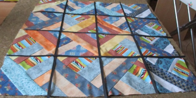
What do you think – with or without?
About https://vivinfrance.wordpress.com
All poetry, prose and pictures posted here, except where otherwise stated, is my own, and may only be used elsewhere with my expressed permission.
Please don't be inhibited from correcting my bloopers and making suggestions: Most of what I post here is instant, ill-considered and off-the-cuff, in serious need of editing.


I know nothing about quilting, but I love the stained glass idea.
LikeLiked by 1 person
Tricky! The top look is softer but the bias kind of ‘pulls it together’? Probably no. 2 🙂
LikeLiked by 1 person
Ta. Bias is no fixed and quilting started.
LikeLiked by 1 person
I prefer the top one, my eye was allowed to meander across freely appreciating the flow of the individual squares. 😀
LikeLiked by 1 person
Both are beautiful but I’d say my preference is with the majority–the second one. Love the colors…so calming to me.
LikeLiked by 1 person
It’s pretty either way, but I like the window pane effect the strips give. That dark makes the colors seem even livelier. (love that rust-orange batik)
LikeLiked by 1 person
I think the one with the bias strips is my favourite too. It has a look of a stained glass window about it.
LikeLiked by 1 person
I like the one with the bias strips. I find it more pleasing to the eye😊
LikeLike
I like the look of the lower photo.
LikeLike
I think that one wins.
LikeLiked by 1 person
I prefer the one with the bias strips. To my eye, it is more ‘bien arrangée’, perhaps like its future owner…?
LikeLiked by 1 person
You are absolutely right – that describes Annette to a T.
LikeLiked by 1 person
I think I prefer the one with the bias sashing. it makes it look like window panes
LikeLiked by 1 person
I vote for the un-biased one. I like how the lines of the blocks interact with each other. The strips distract me from the pattern. I think the better question is, what would your friend prefer?
Either way, it’s a good looking quilt.
LikeLike
I shall ask her tomorrow and until then I will gather my forces for the final work!
LikeLiked by 2 people
I like the bottom one better, visually. More work I know but adds dimension. Just my 2 cents worth. I love it any way you finish it. Just lovely.
LikeLiked by 1 person
Thank you. The scales are tipping towards the black strips option. I’ll have to pacify the grinch, who is firmly for the plain version.
LikeLiked by 1 person
😦 Either way, it’s beautiful. You have the strips bought, so you must use them now. 🙂
LikeLiked by 1 person
Good thinking
LikeLiked by 1 person
What a great scrappy quilt! I like the black bias a little more, but I have this blackish faze going on just now… If you know who is receiving the quilt, their personality might give you the answer?
LikeLiked by 1 person
It’s for an 84 year old French friend. She’s very chic, always immaculate.
LikeLiked by 1 person
I like both but the second one better and have no idea why, lol…
Elizabeth
LikeLiked by 1 person
Three to two so far!
LikeLike
I am not a quilter, but I like the top photo. That is my “un-biased” opinion. Pun intended. 😄
LikeLiked by 1 person